The story behind Yale's rebrand
THE STORY - TRIPS TO CHINA & THE MIDDLE EAST
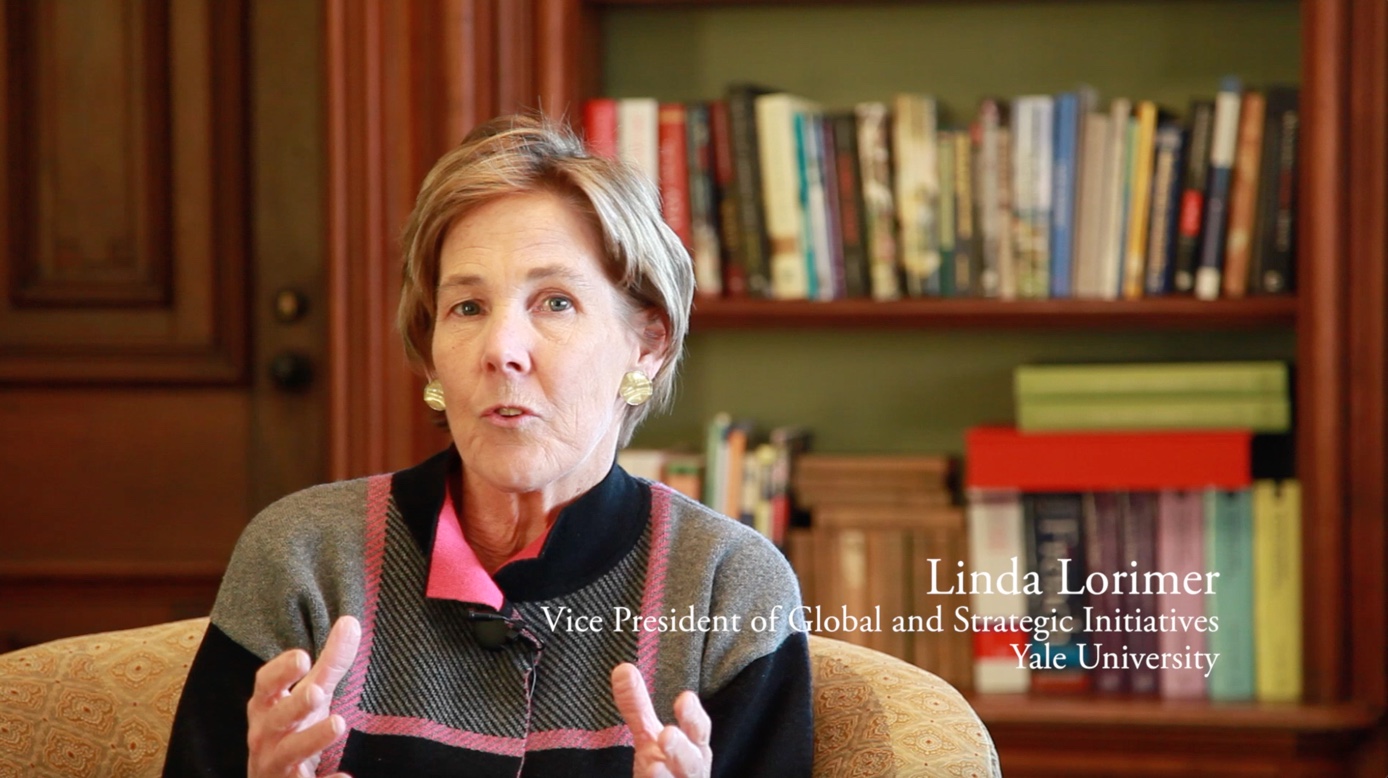
"I had many trips to the Middle East, where many people with didn't know English. They could not read the word Yale. But they could understand what Coke was. They knew what IBM was. Why was that? They didn't know the letters either. But they knew the consistency of the word mark for these well known institutions." -- Linda Lorimer, Yale VP of Global and Strategic Initiatives
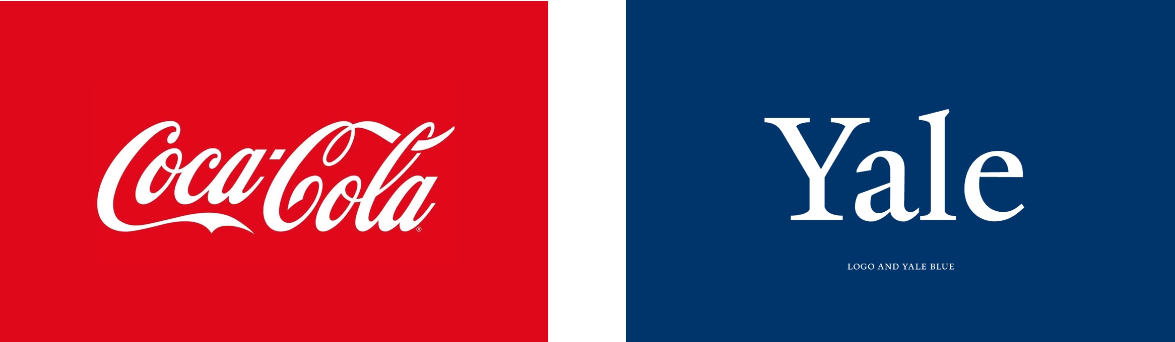
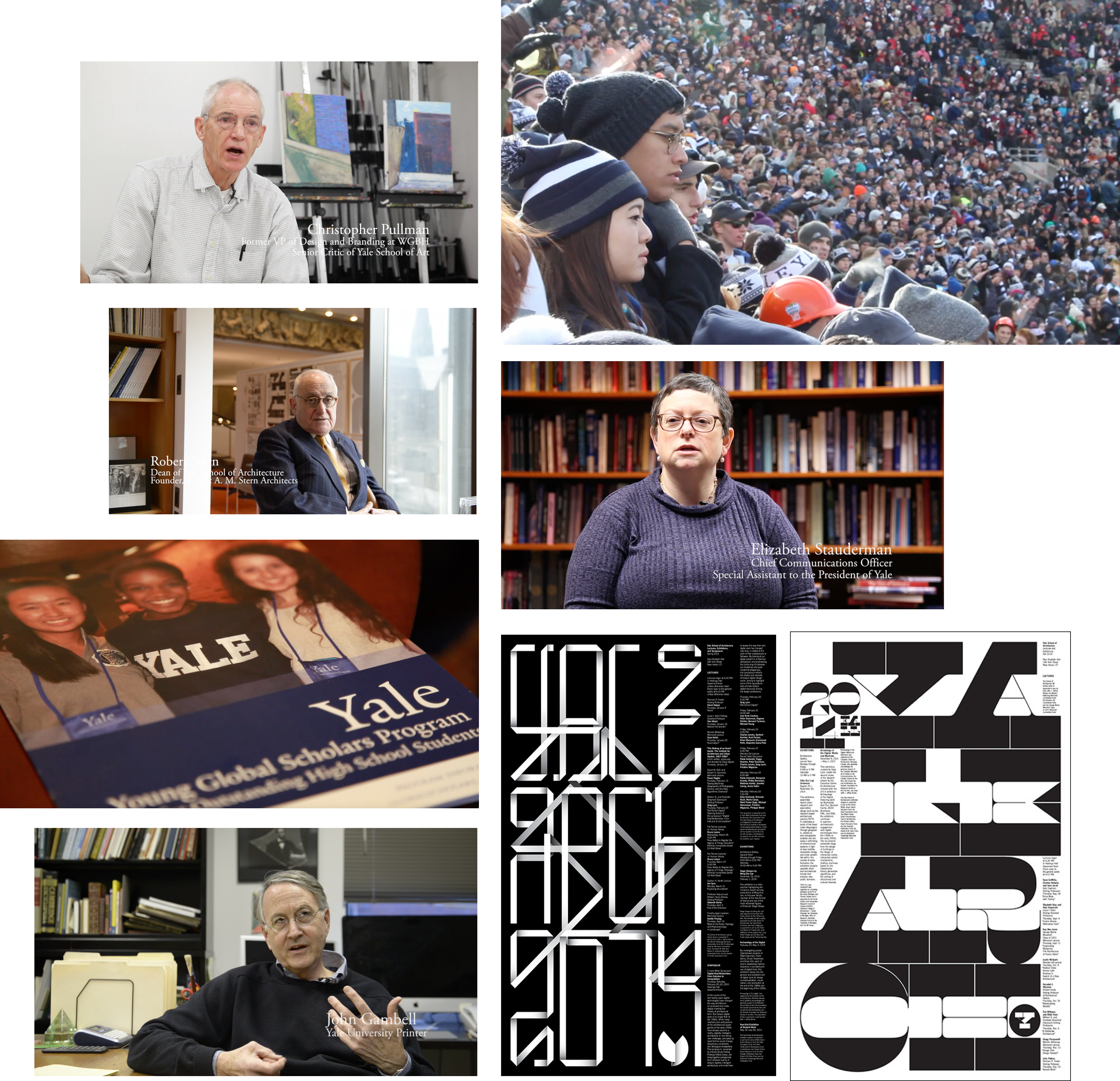
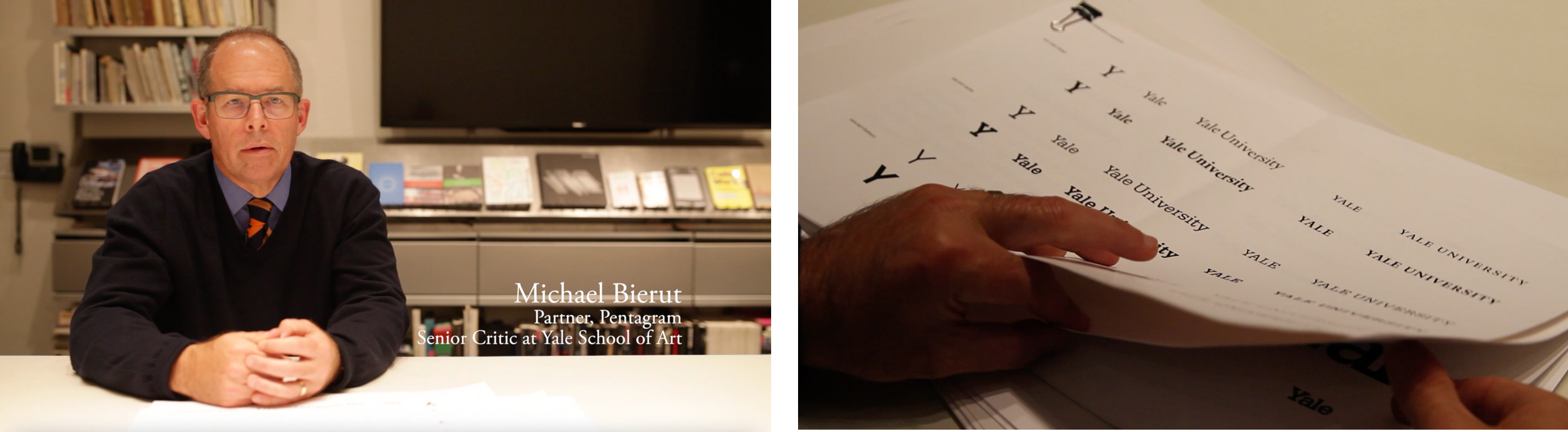
The story started when Yale President Rick Levin went on a trip to China and realized a problem: "if you didn't have the English alphabet that you're familiar with, how would you know Yale as Yale?" This was reinforced when Linda Lorimer, the Yale Vice President of Global and Strategic Initiatives, realized that when she travelled to the Middle East, many people didn't know English but they knew what Coke and IBM were, not because they knew the letters, but because they knew the shape and consistency of the word mark for these companies. This made them reflect on how Yale should redesign its graphic identity to support its brand as a global educational institution that can be recognized by people from any country. They then hired Pentagram's Michael Bierut to redesign its branding, Matthew Carter to redesign its typeface, John Gambell and more to rethink how its rebranding should look like.
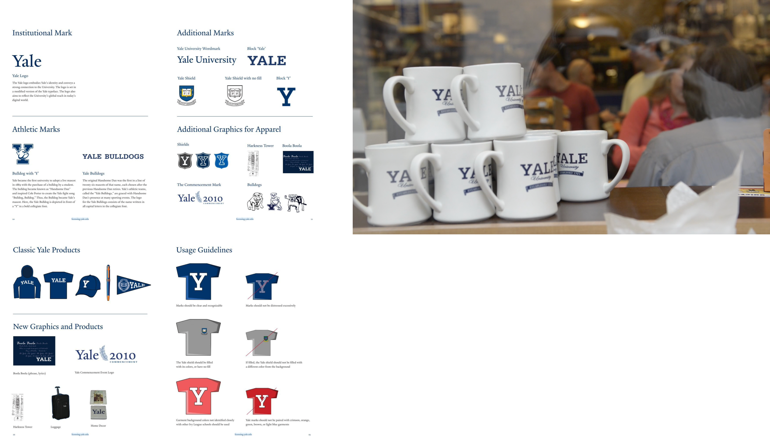
They made a decision that instead of using a university emblem as the core logo, they would make the four letter words "Yale" as the logo. Designed in the Yale Typeface, the word "Yale" would constitute to the core of its brand.
"For most people, this is one of those things we're only going to buy once. It's not like buying toothpaste, where you're gonna buy Colgate usually, and then you try Crest, and then you try Crest with extra tartar protection. In the world of consumer branding, novelty and constant change are seen to be a good thing. The difference between branding for a university and a typcial commercial client is primarly the nature of who the 'customer' is. If you're going to Yale, you're going to Yale, it's all around you. You arrive in September and presumably in the next four years it will be a profound part of your identity." -- Michael Bierut, Partner at Pentagram
Competing in the age of iTunes
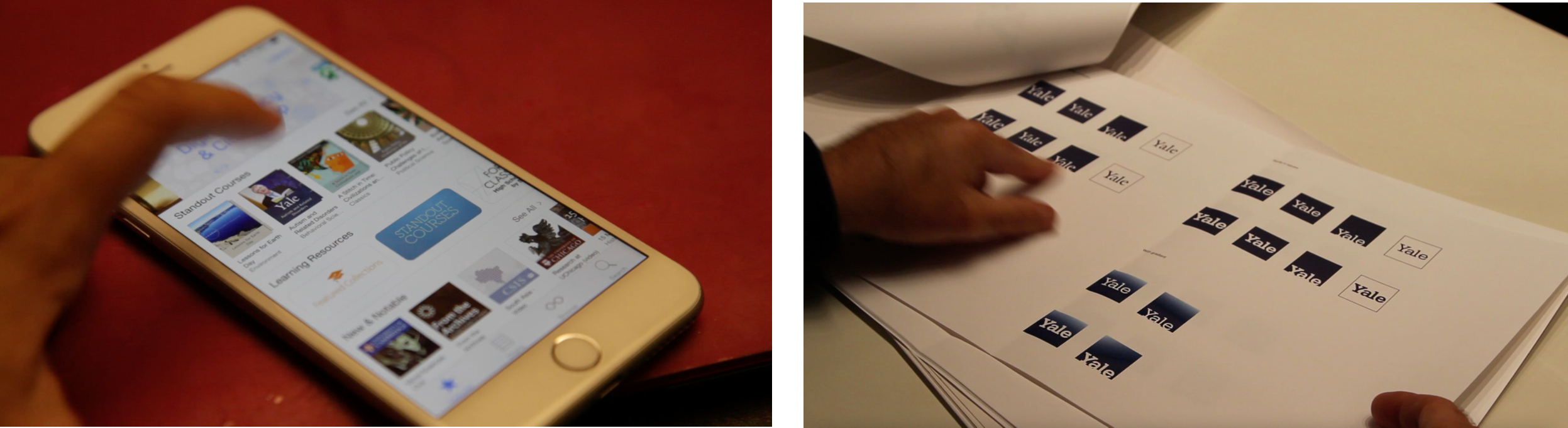
Another reason for rebranding was the digitization of educational content and the rise of education media such as iTunes, where many people were downloading lectures and course materials. In MOOCs or iTunes, users were looking at a selection of icons that were quite small, every brand had the same amount of real estate to work with physically, and with such limited space, low resolution, and intense competition, the question was how we could resolve it in a way that could make it stand out. The four letter wordmark played an important role in makimg this work.
Further explorations - the Yale typeface and the Yale Blue
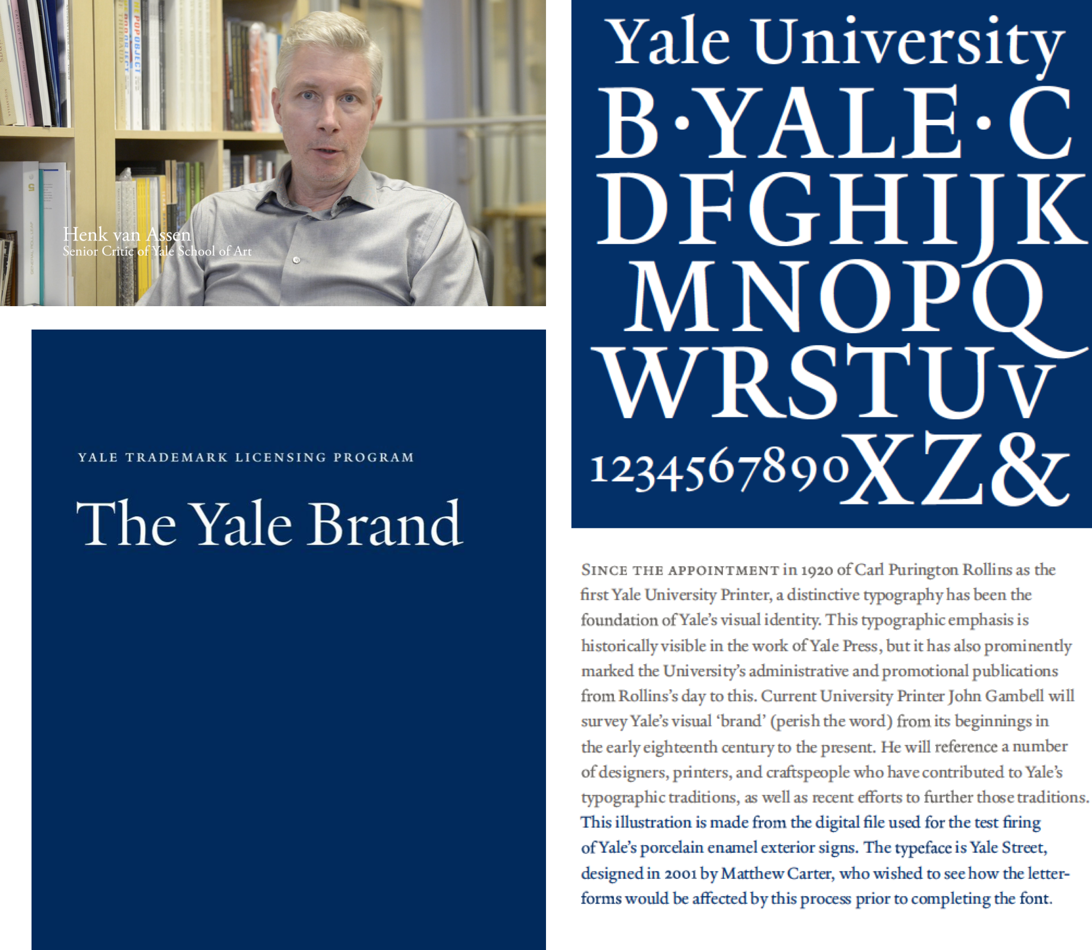
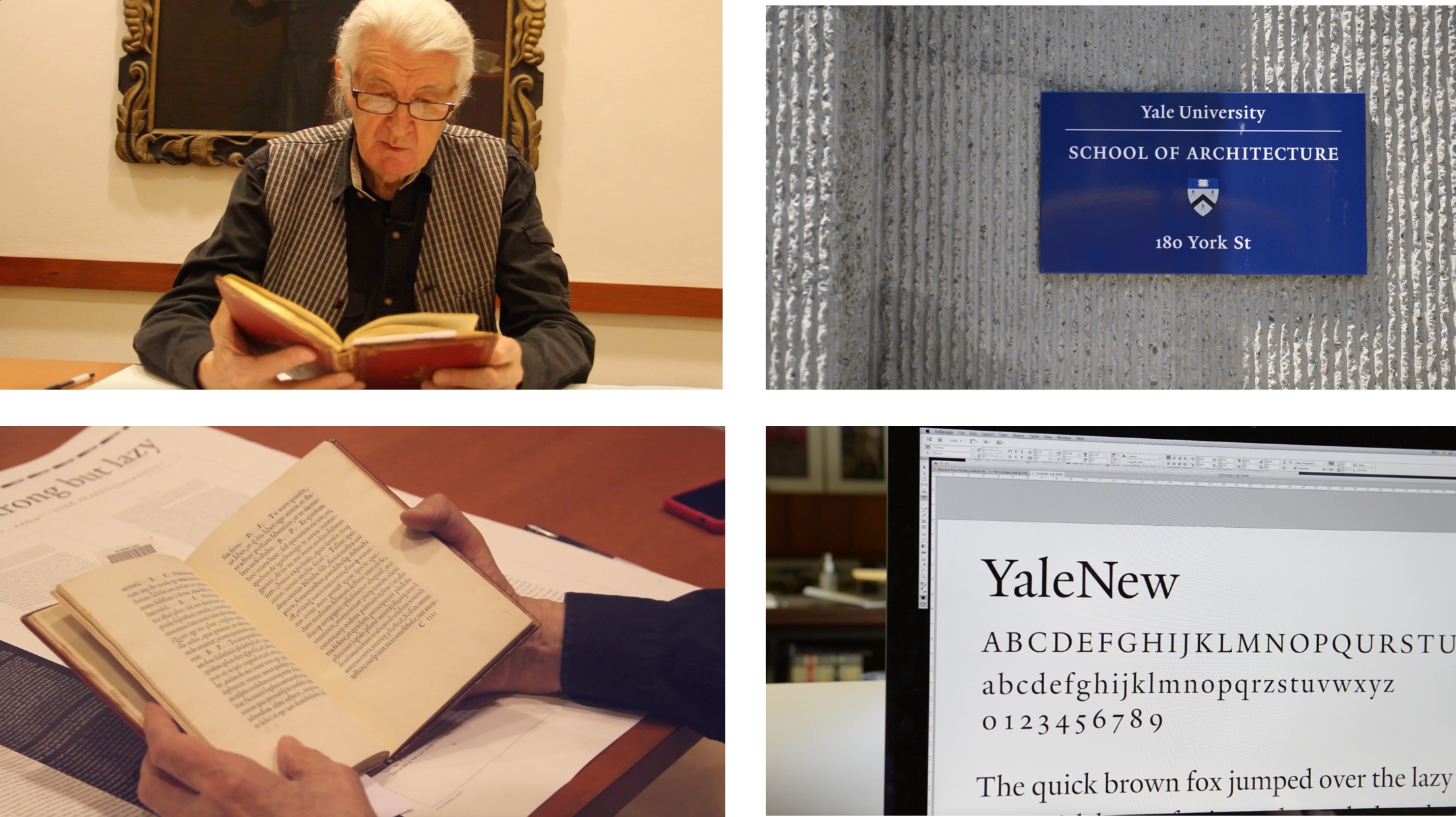
The documentary then explored the core of Yale's graphic rebranding -- the Yale Typeface that was created by Matthew Carter, the typographer who also created Helvetica Compressed, Georgia, and Verdana. We explored his inspirations of the typeface from Bembo and De Aetna, which represented one of the breakthroughs in printing technology at that time in 15th century and was known for its synthesis of the capitals and the lowercase. The typeface had to be used in a variety of use cases with campus signs, marketing collatoral, and the web. We also explored the origin of the Yale blue and the Yale bulldog mascot.
Branding & Commercialization
The documentary then moved on to explore the dynamics between branding diversity and commercialization, how Yale can support an umbrella of multiple sub-brands with different organizations on campus, and at the same time, set up a consistent framework for commercial use with multiple brands such as fashion. Yale was also the first college in the US to include graphic design as a body of study. It is interesting how Yale's rebranding gives Yale a clean, humble, and novel look while being able to preserve various traits from its traditional roots.
"Graphic design as a body of study in the United States and then afterwards a profession called "Graphic Design" was really invented at Yale, the School of Art, by Alvin Eisenman. His students included the people that would go on to design logos for Mobil Oil, Chase Manhattan Bank, Xerox, you know, Corporate America as it existed in the mid twentieth century. So the idea of branding, to a certain degree, you can trace to Yale." -- Michael Bierut, Pentagram