The Old Mission Control
The old mission control was bootstrapped a long time ago by our developers. Althouth it includes all the data and functions, there is a lot of wasted space. The hierarchy of different components makes the overall workflow less smooth than it could be.
The Design Process
In order to understand how people at Runscope use our Mission Control, I interviewed 2/3 of the staff in our company, half through one-on-one talks and half through Slack. I understood more about their daily workflows and the components in the platform that help them accomplish their tasks. From the interview, I learned that people use Mission Control in a few major ways.
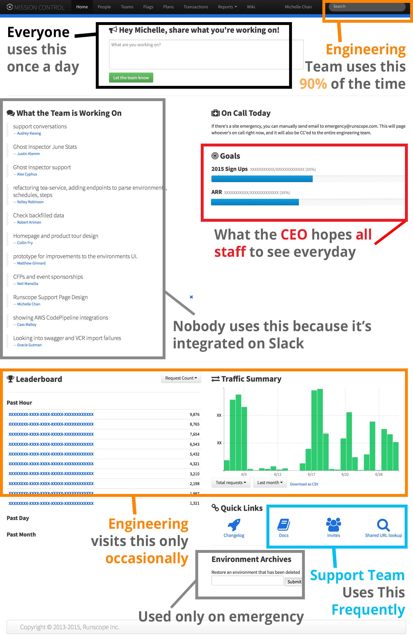
1. ENGINEERING TEAM
The major function that engineers use is the search bar at the top right-hand corner. Usually, they have to search for customer account information to identify and solve problems encountered different API requests and tests. They seldom use the "what are you working on" section because it is integrated to Slack. Other components that they use are the traffic summary and the leaderboard.
2. COMMUNICATIONS & SUPPORT TEAM
People in the communications & support often report their work in the "what you're working on!". The support team also uses the Quick Links (Shared URL Lookup & Docs) to solve customer support tickets.
3. FROM THE CEO: GOAL OF DASHBOARD
I also asked our CEO, John Sheehan, about what he envisions in the new dashboard page and what types of information he hopes to deliver to his team on the homepage of Mission Control. Like any internal company dashboard, it is important to display more relevant, motivating statistics to the team, such as the number of users and test runs. For the old Mission Control, there were only statistics for yearly goals and Traffic Summary. Yearly goals are less motivating because they increment pretty slowly.
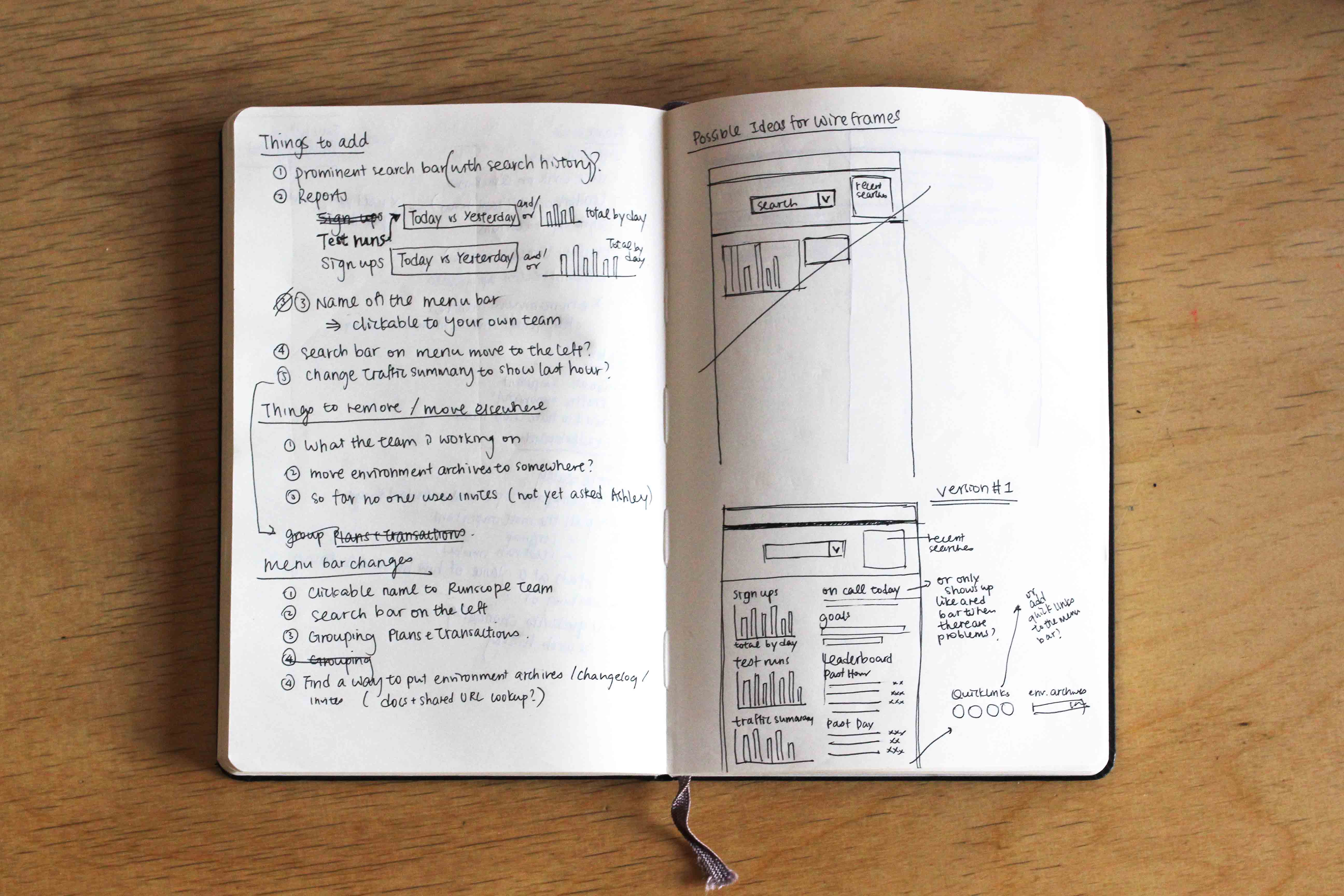
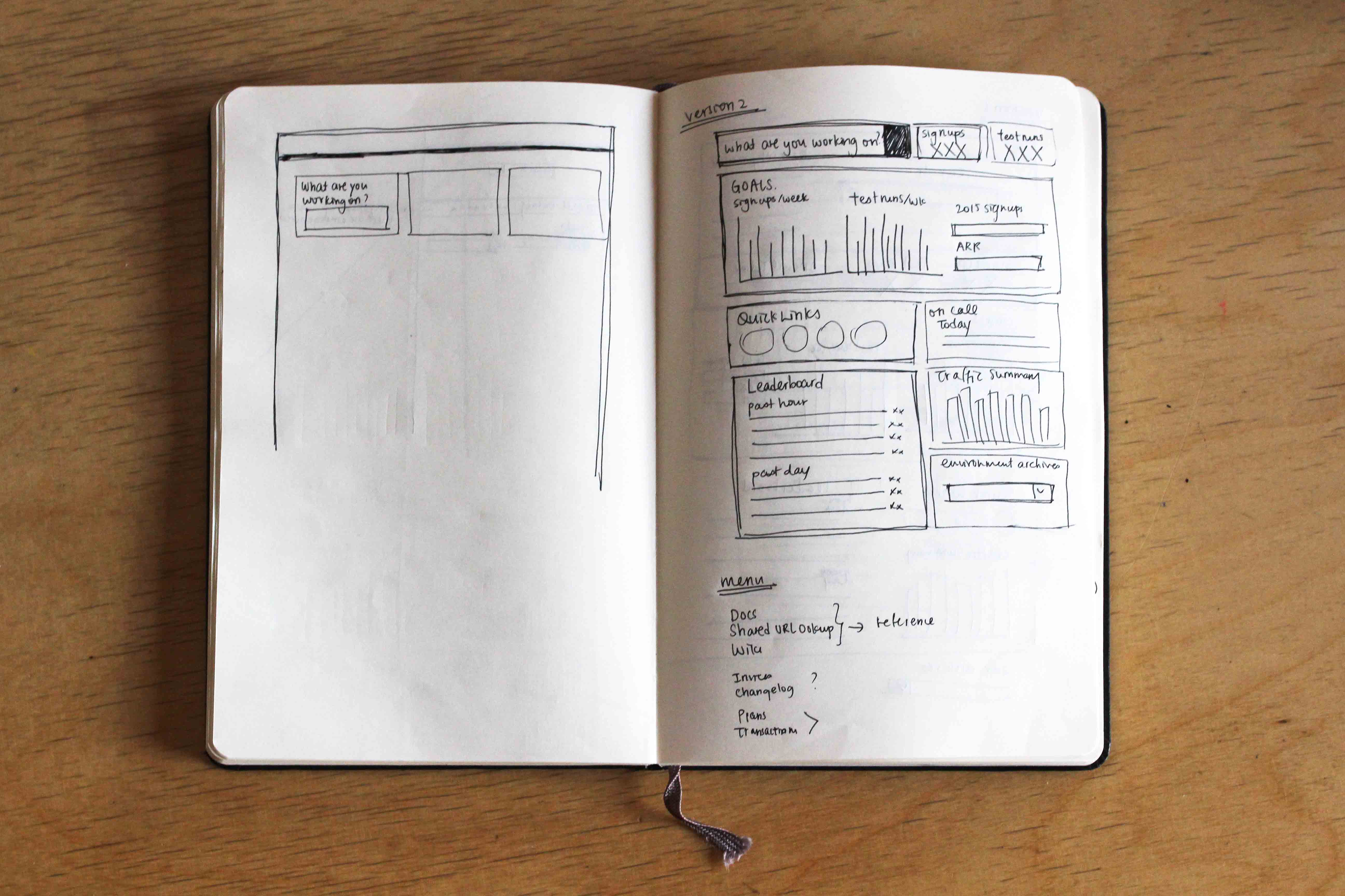
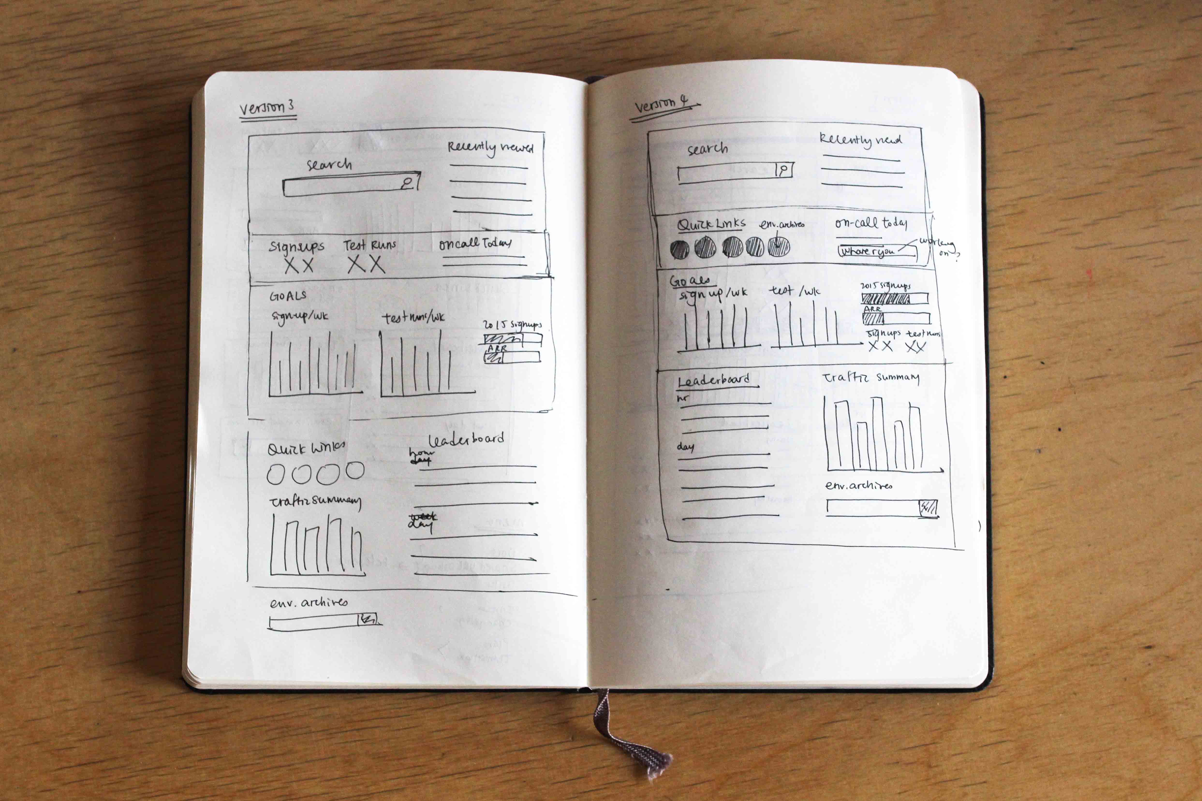
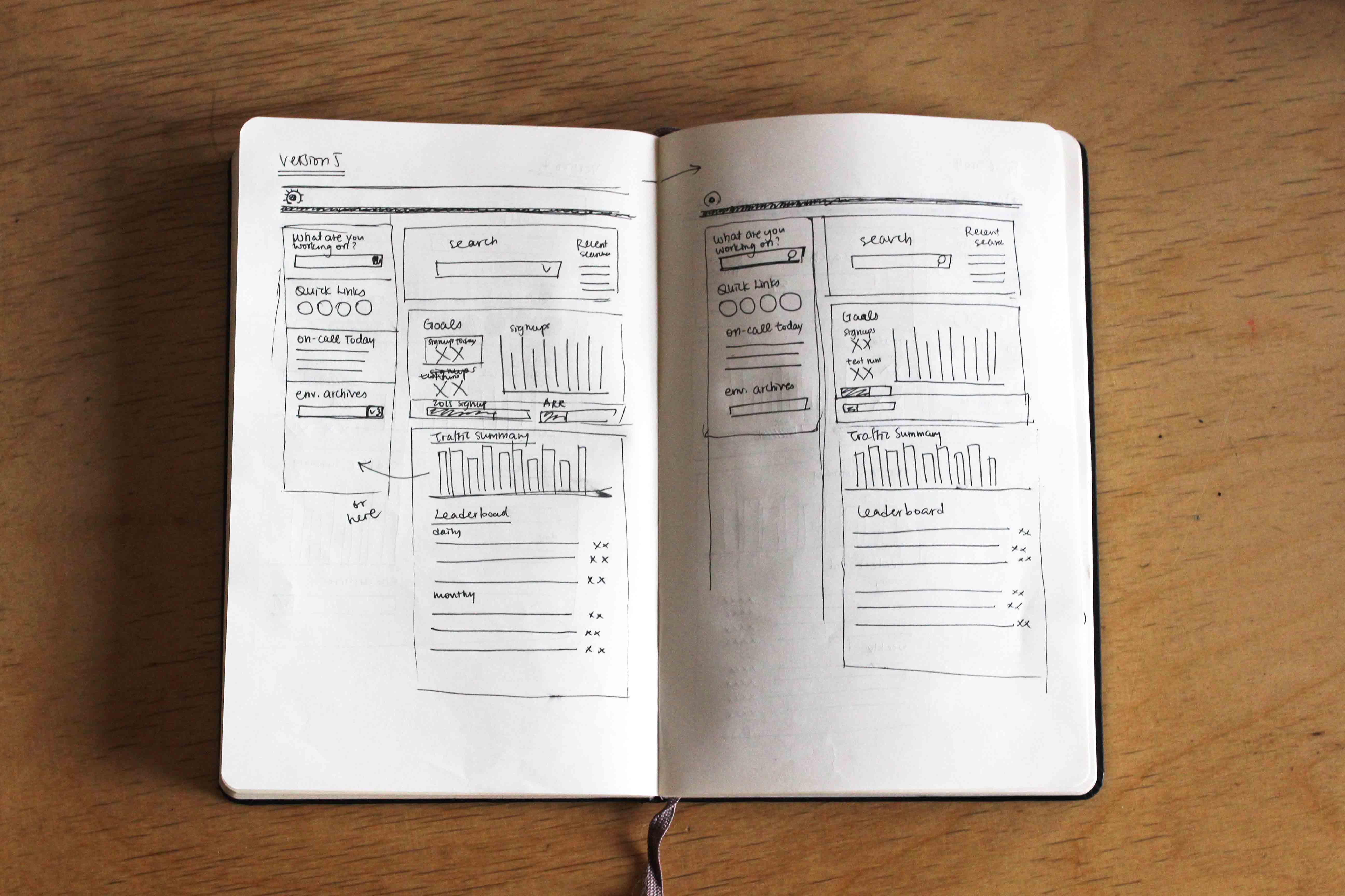
Early Sketches
I made a few sketches on paper, experimenting with the position and hierarchy of different components to cater the needs of engineers, communications, and support team. I also researched on the types of Keen graphs that would be helpful to be displayed on the homepage Mission Control.
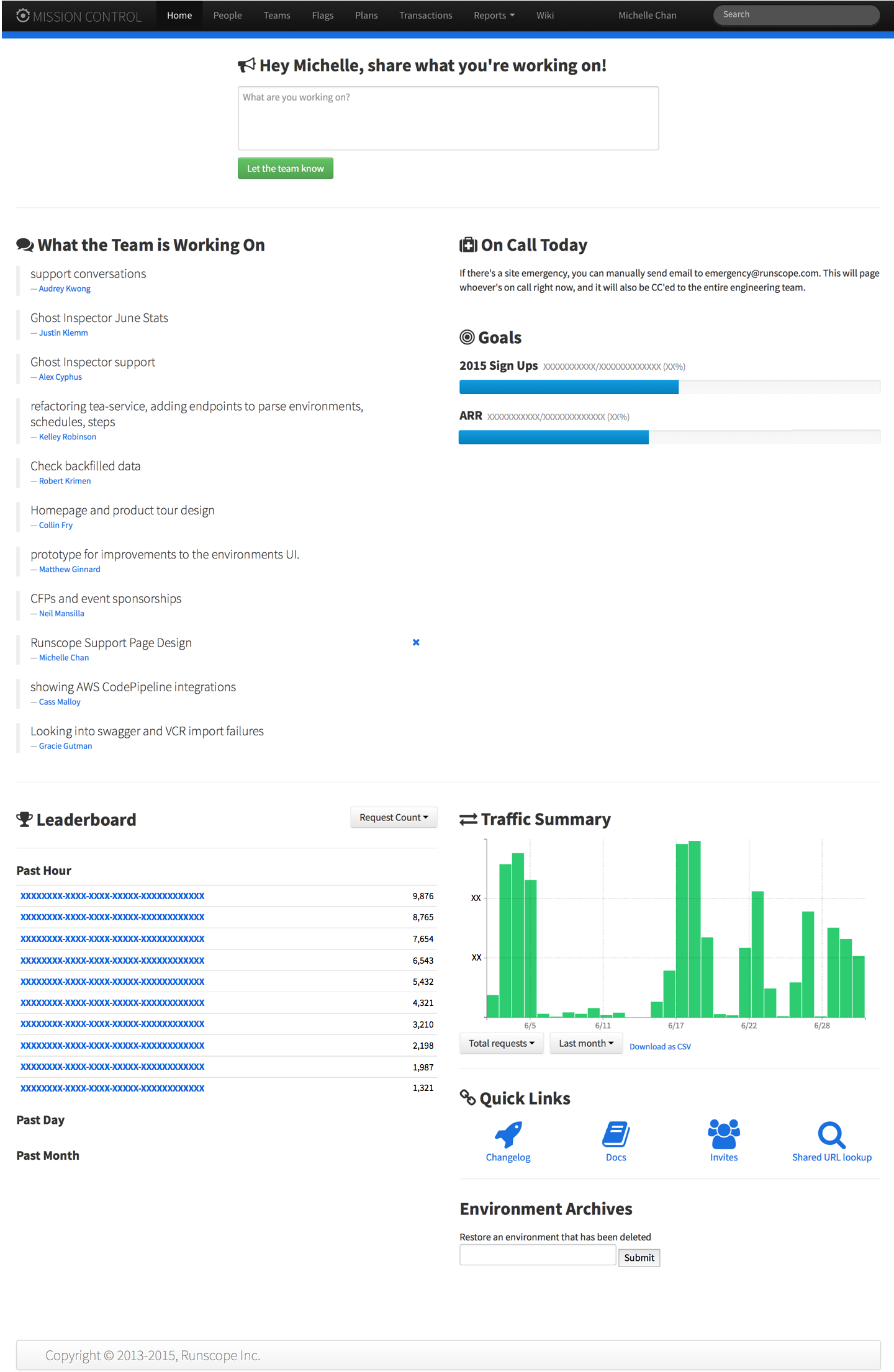
First Prototype
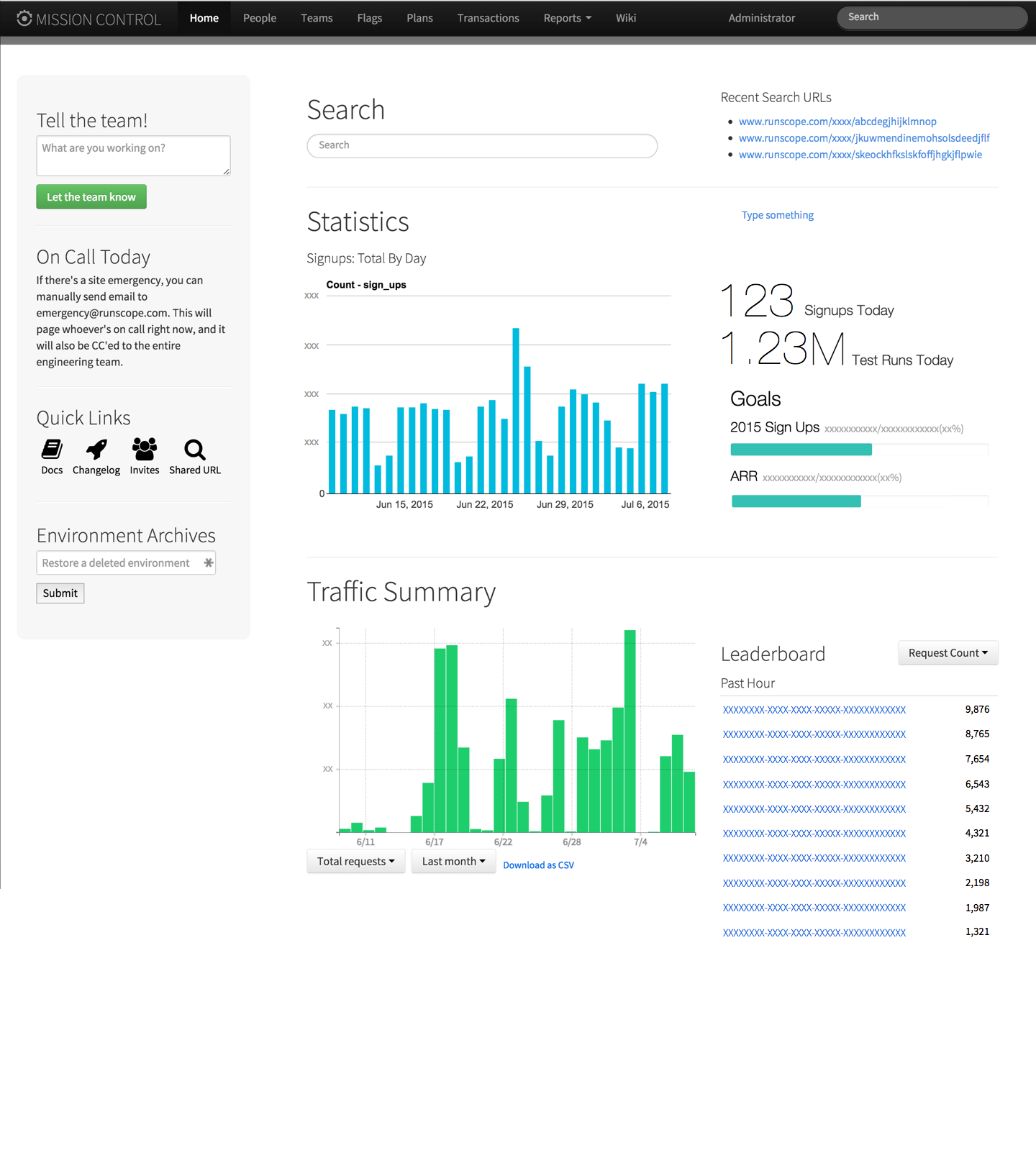
I did not make any high-fidelity prototypes on Sketch or Photoshop and immediately started coding the Mission Control Page because different components are already readily available on the original version. In this version, I made better use of space and made the following major changes:
1. THE LEFT GREY COLUMN
I placed the "What you're working on", "On Call Today", "Quick Links" and "Environment Archives" in the left grey column. The support team can have access to Quick Links without scrolling down the page and the rest of the team can view who is on call easily when they first log into dashboard. These components may be used frequently, but may not deserve a prominent position in the middle of the dashboard.
2. SEARCH
I made the search function more prominent on the dashboard so that engineers can easily search within the site.
3. KEEN GRAPHS & STATS
I researched on the types of graphs available in the Report section of Runscope, and created new graphs that suit the needs of what the dashboard should show to the team. I also placed some available statistics (daily test runs and signups) on the page.
Feedback from the first prototype
After finishing the first design, I asked for feedback from different members of the Rusncope team for suggestions and improvements. One important feedback that I got from the engineering team is that although the search bar is made more prominent in the Mission Control, its position is not consistent with other pages on the site where the search bar is still on the top left corner. Another feedback was that they like the Keen graphs that were brought up to the homepage, and they hope to be able to see more statistics and graphs, including daily and weekly test runs and signups.
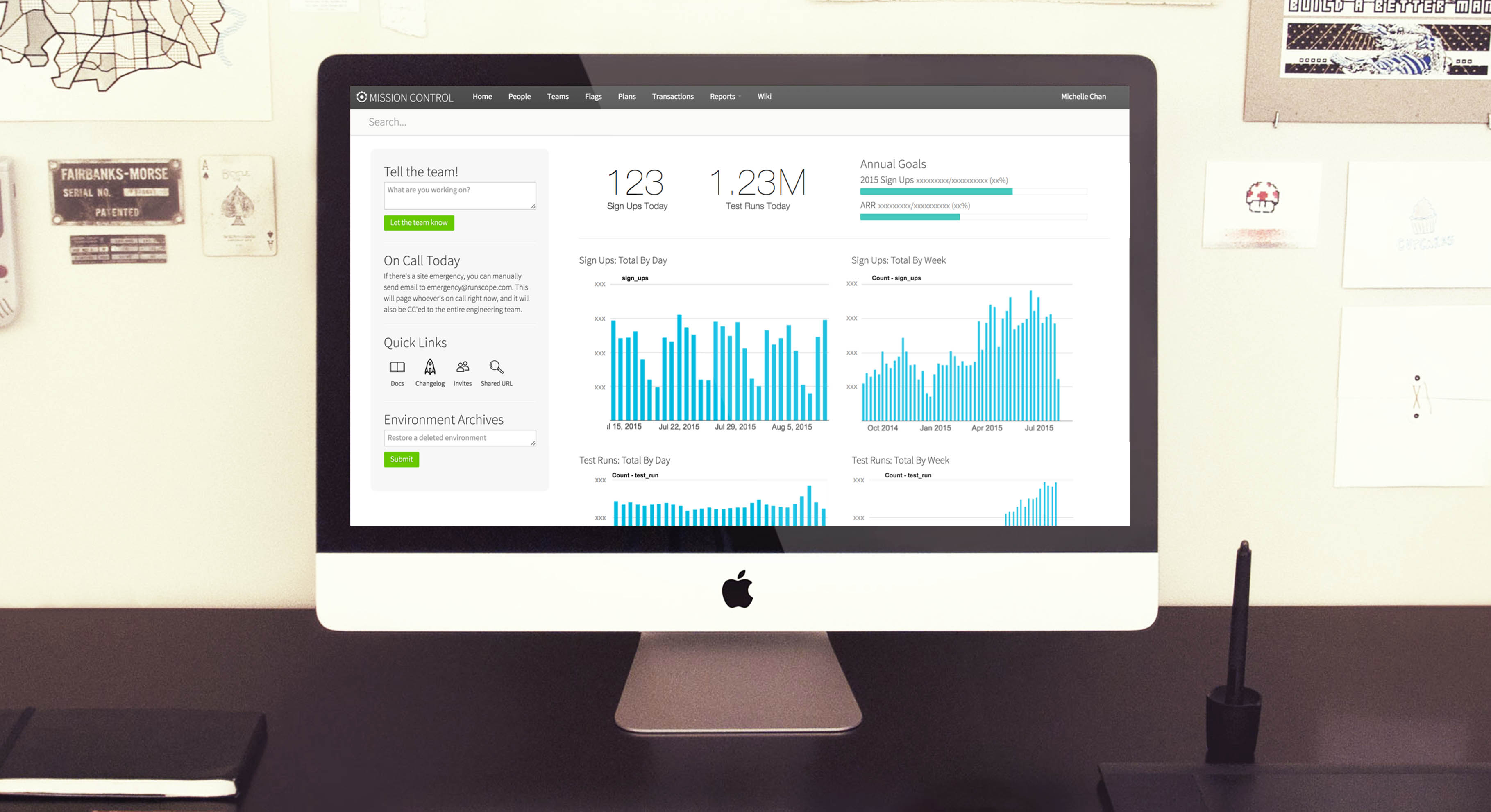
Final Design
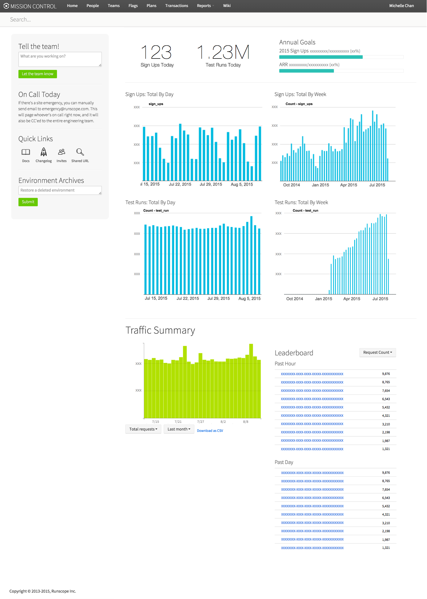
I worked on improving the first prototype after collecting feedback from the team. The search bar is now placed on top (right below the grey bar) and it shows up on every page within Mission Control. I also created more Keen graphs for test runs and signups. I included the weekly graphs in the dashboard because compared with the daily charts, you can see the increasing trends more clearly.