The Old Hurl.it Page

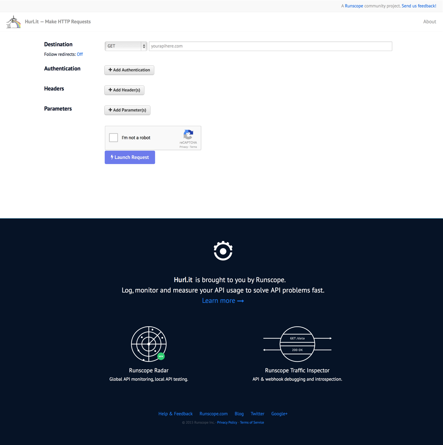
The old Hurl.it page has a Runscope banner but the conversion rates from the Hurl.it site to Runscope was only 16%. The banner was not able to clearly explain how Runscope works and was not convincing enough on how Hurl.it users would find Runscope useful.
The Design Process
I talked to our CEO, John Sheehan, as well as our Business Development Lead, Neil for more insights about the project. Both of them mentioned that the reason why Hurl.it has gained such popularity is that it is a community project instead of a commercial tool. Although Runscope owns Hurl.it, rebranding the whole site to fit that of Runscope may deter its original audience from using it. Therefore, while Runscope hopes to attract Hurl.it users, we can only change the banner on the bottom of the site so that it is not distracting users from the site's original purpose and function.
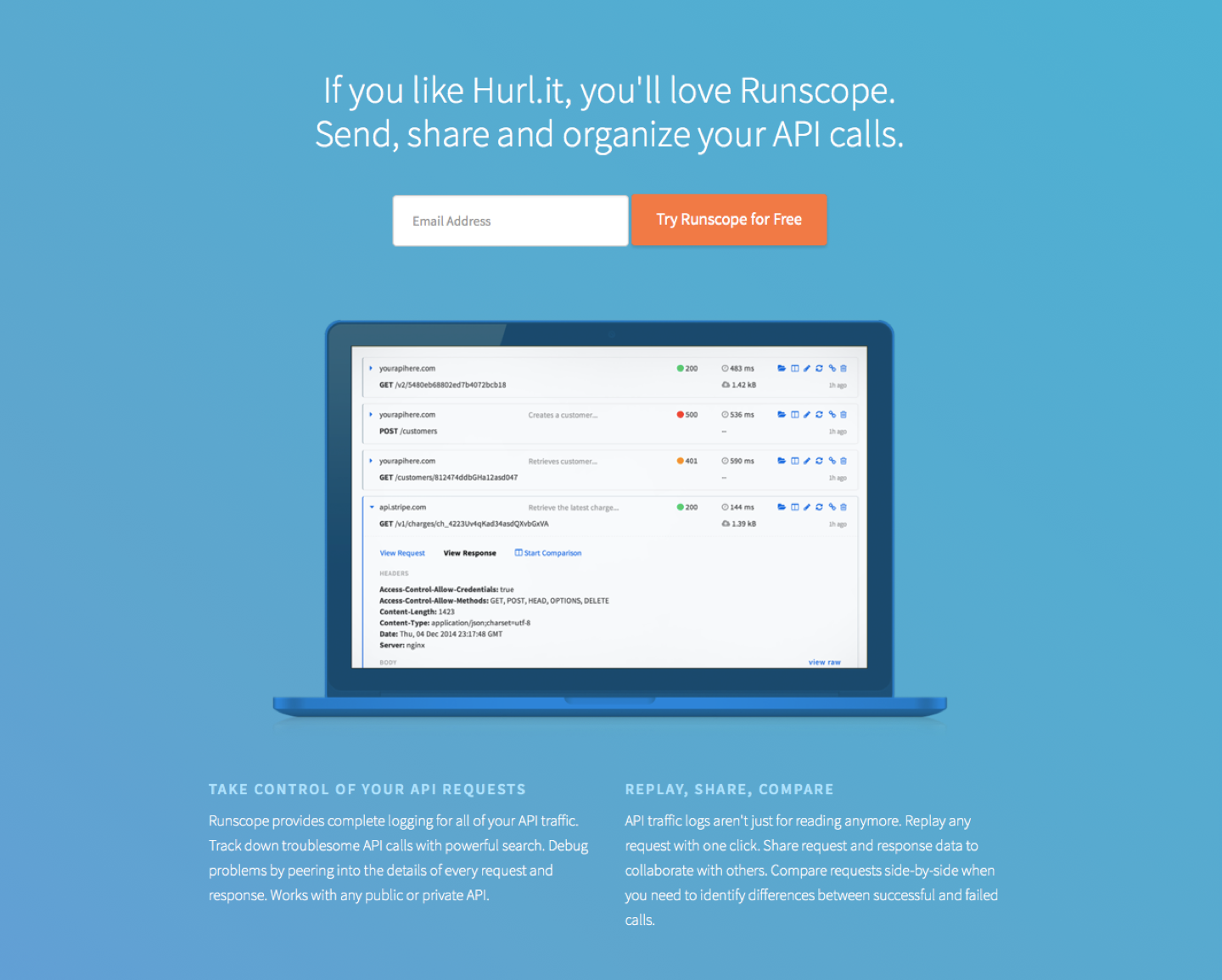
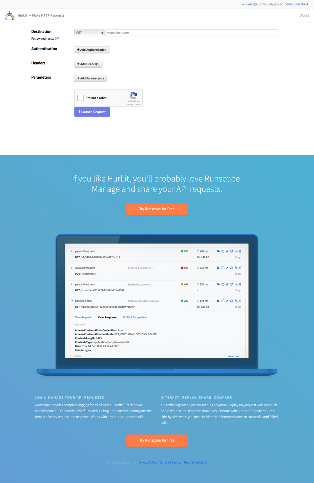
Then, I focused on crafting the content. I did some research on the similarities between Hurl.it and Runscope, as well as why Hurl.it users may benefit from using Runscope. Runscope provides all features available on Hurl.it, but the main advantage of Runscope over Hurl.it is that Runscope users can save, organize and share their API requests. Therefore, I changed the title, content, and images on the banner to make them more relevant to Hurl.it users.
THE OLD BANNER TITLE

THE NEW BANNER TITLE

THE OLD BANNER CONTENT

THE NEW BANNER CONTENT

Although Runscope provides other tools such as Runscope Radar and Runscope Traffic Inspector, these may be irrelevant to Hurl.it users who only want to make HTTP requests. Therefore, I focused more on the ability of Hurl.it users to organize and share their HTTP requests in the content.
The New Design #1

I made a few sketches on paper, experimenting with the position and hierarchy of different components to cater the needs of engineers, communications, and support team. I also researched on the types of Keen graphs that would be helpful to be displayed on the homepage Mission Control.
RESULTS OF THE 1ST DESIGN
After shipping the new design, there percentage of people clicking the Call to Action increased from an average of 16% to 59% within the week. However, the number of people who actually register after visiting Runscope's homepage is only 24%.
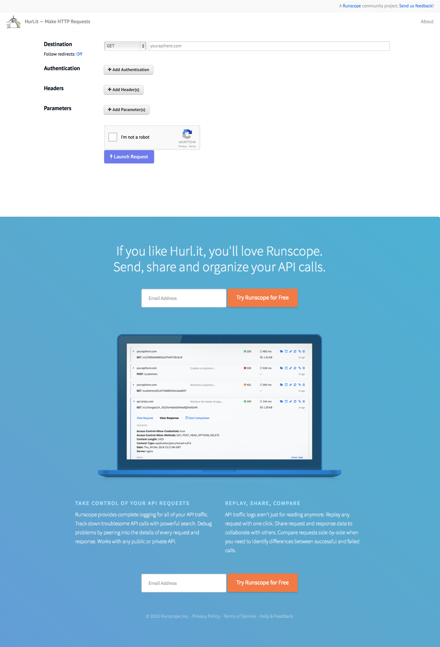
I then added an email input next to the Call to Action button so that Hurl.it users can register on Runscope directly.
The Final Design

RESULTS OF THE FINAL DESIGN
Although the number of people clicking the orange button decreased from 59% to 46%, all the numbers converted to actual registrations on Runscope. Users are able to use the Runscope platform right after clicking the button and Runscope is able to collect email addresses of the Hurl.it users for promotion in the future.