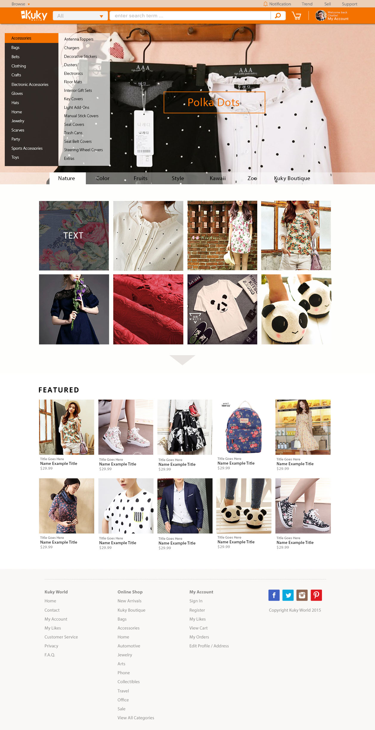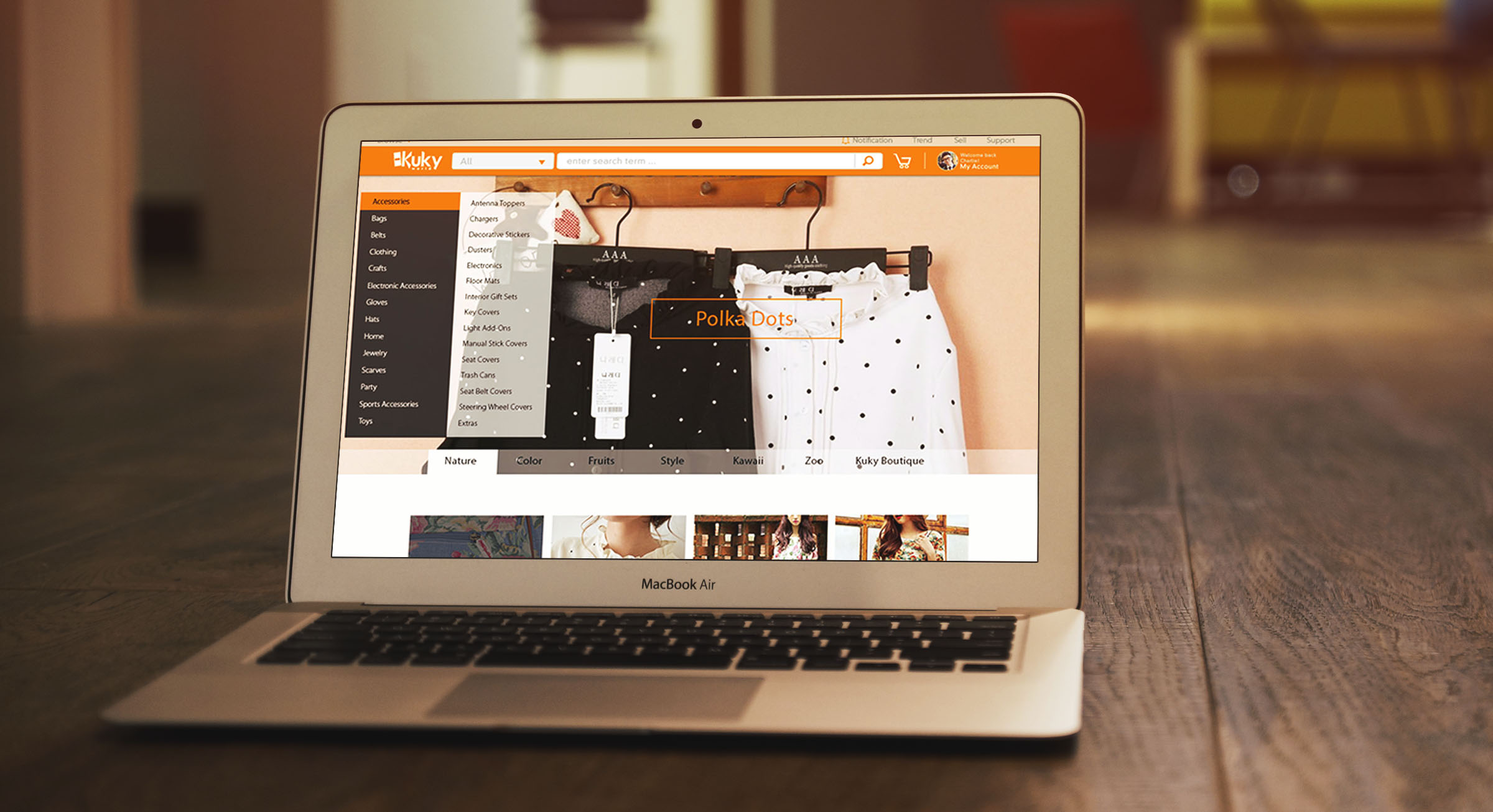
The Old Homepage Design
These are the main issues that we discovered in the old design:
1. It doesn't look like a shopping site. The graphics are artistic but they do not make customers want to buy Kuky products.
2. The top orange and grey menu bars are difficult to navigate and complicated to use.
3. The "colors" banner wasted a lot of space that could be better utilized. As this area is critical in providing first impression to users, we should probably use this space to tell users what Kuky World is and how it differentiates from its competitors.
Customer Analysis
1. WINDOW SHOPPERS
In order to create a design that better suits Kuky World, we had to better understand the types of customers on the shopping site and their behaviors. The main thing that differentiates Kuky World from other online shopping sites is that the products on Kuky World are more unique in taste and are catered to a more niche community. For example, if a person likes pandas, the person could search for all the panda-styled goods -- ranging from backpacks, t-shirts, slippers, to laptop cases. There are two main types of shoppers on Kuky World:
2. PEOPLE WHO KNOW WHAT THEY WANT
Most of the shoppers on Kuky World do not really know what they want. They just know that they love a particular style -- such as polka dots, pandas, leopard patterns, fancy embroidery-- and they want to see what's out there.
Early Sketches
I made several sketches to explore how Kuky World could cater the needs of both types of shoppers and distinguish itself from other online e-commerce sites. I also researched on the designs of US and Chinese shopping sites to compare how different sites cater the needs of their shoppers.
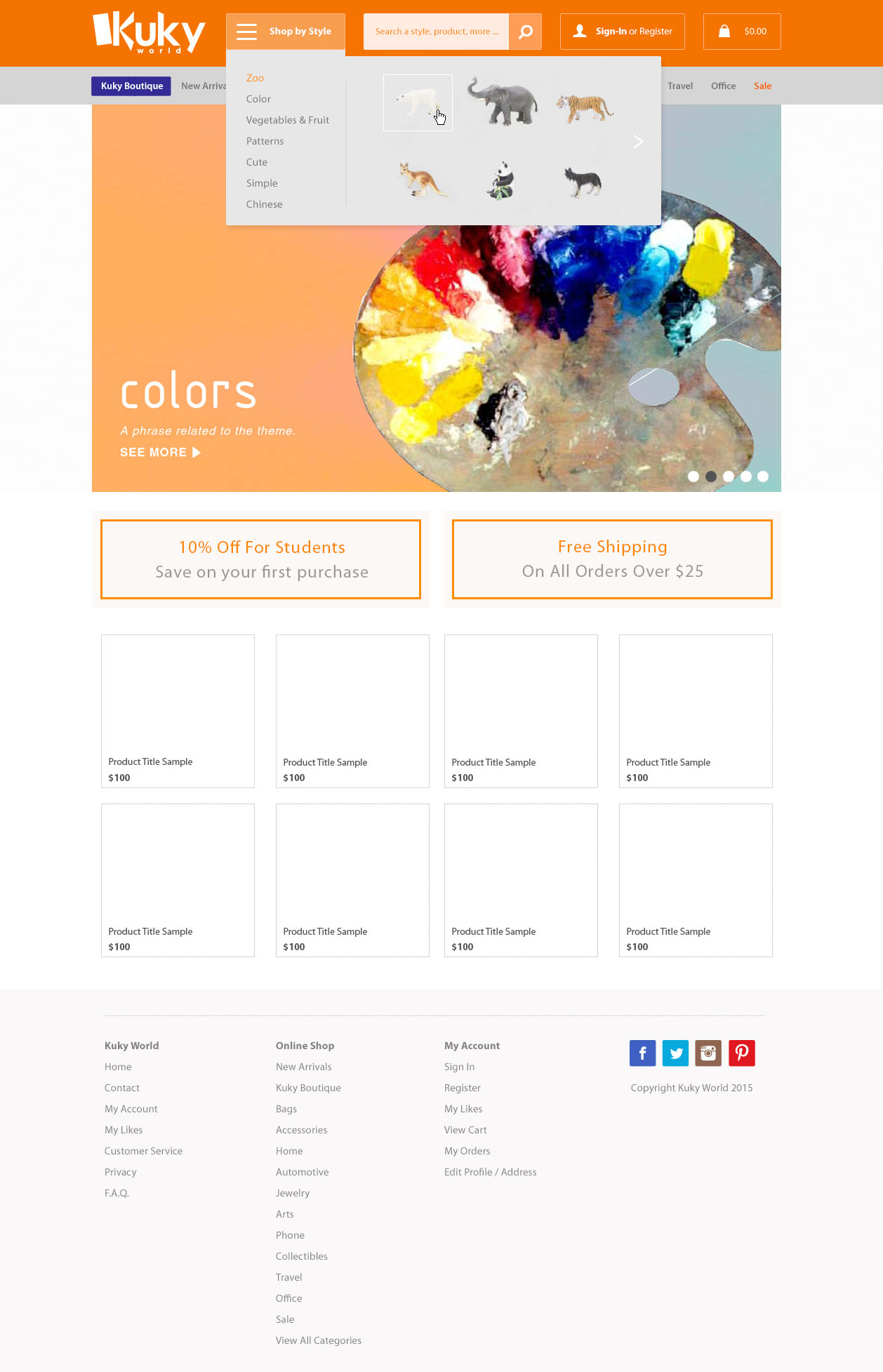
First Prototype
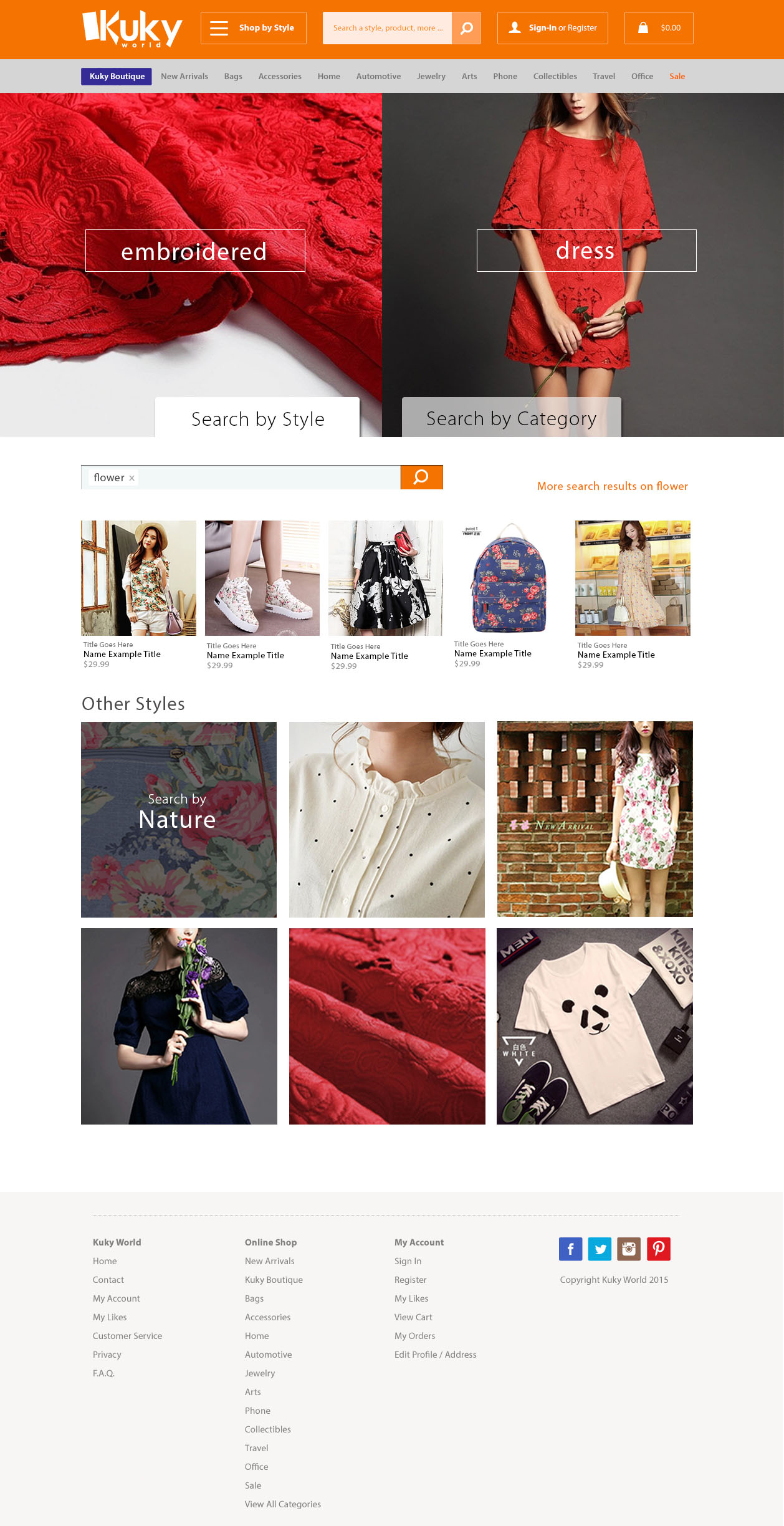
In the first prototype, I focused on educating users how they could shop by "Style" and "Category". Window shoppers who want a particular style may not really know the exact things that they want to buy. Other people may want to look for a new laptop case, without knowing what style they want. There is also a search bar that allows users who are certain about what they want to look for Kuky items directly. However, after discussing with the Kuky World team, they hope to look for something less restricted, especially when the website needs to scale in the future.
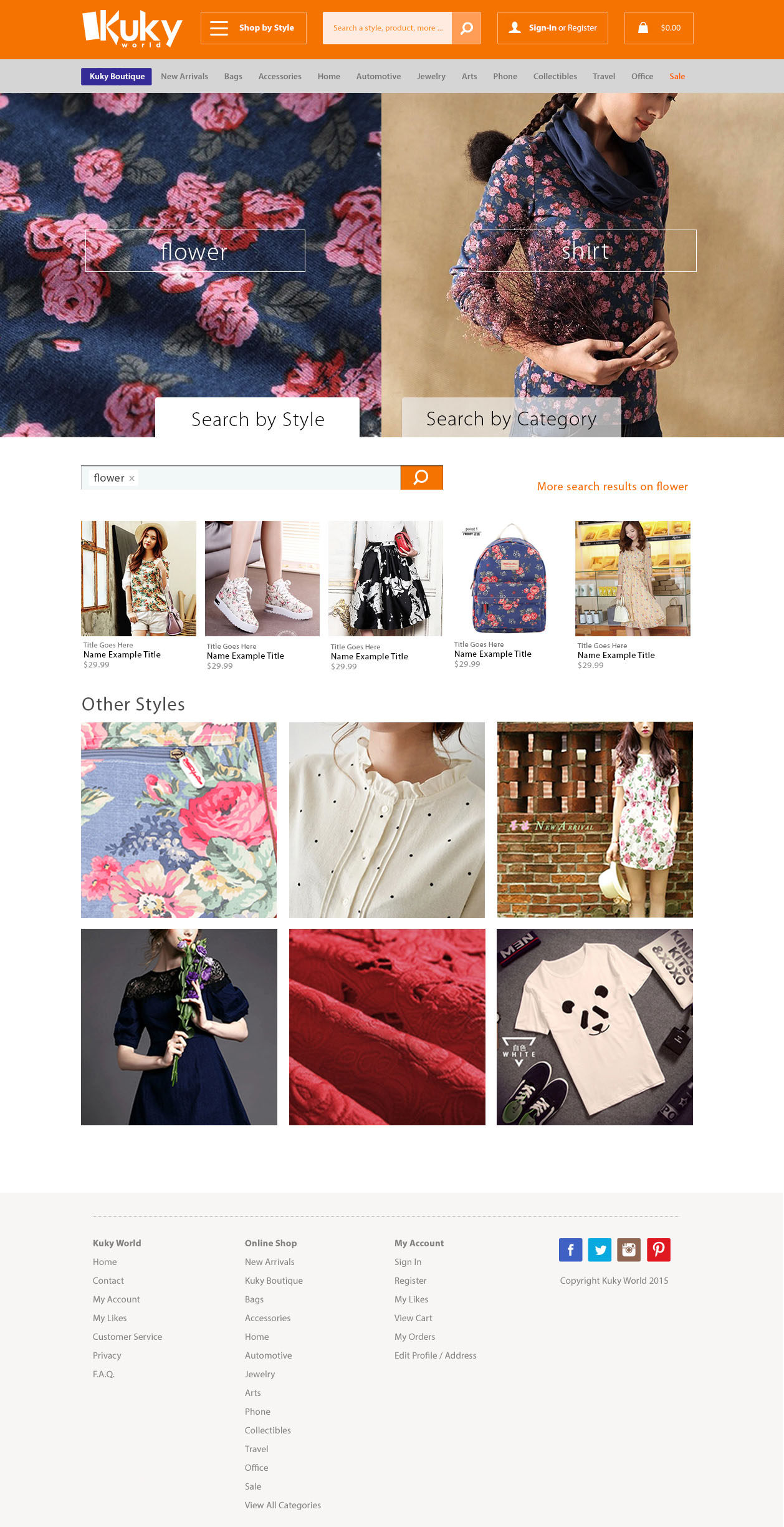
Second Prototype
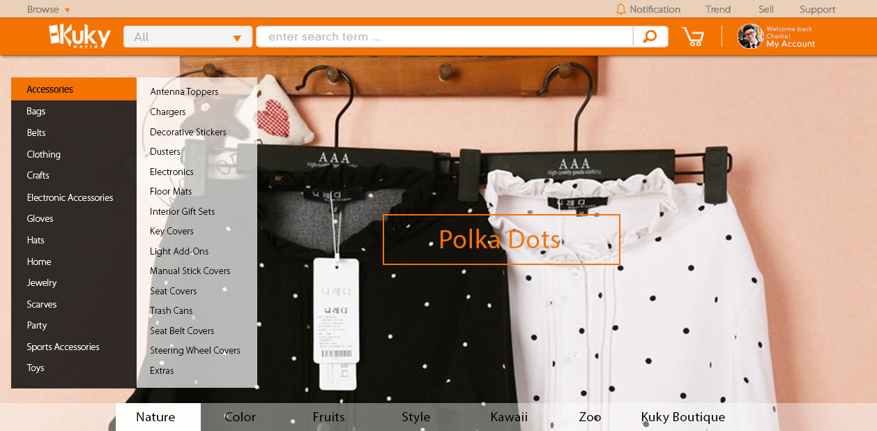
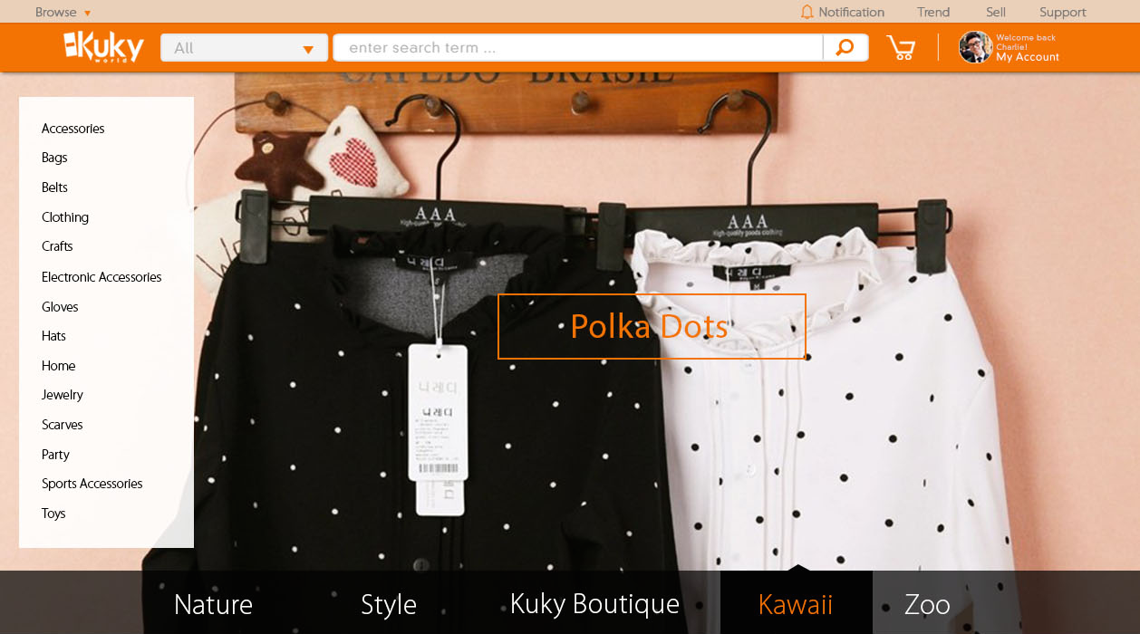
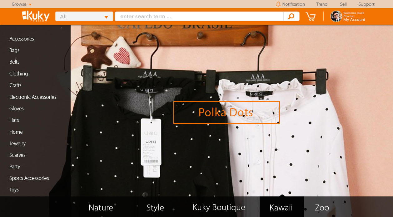
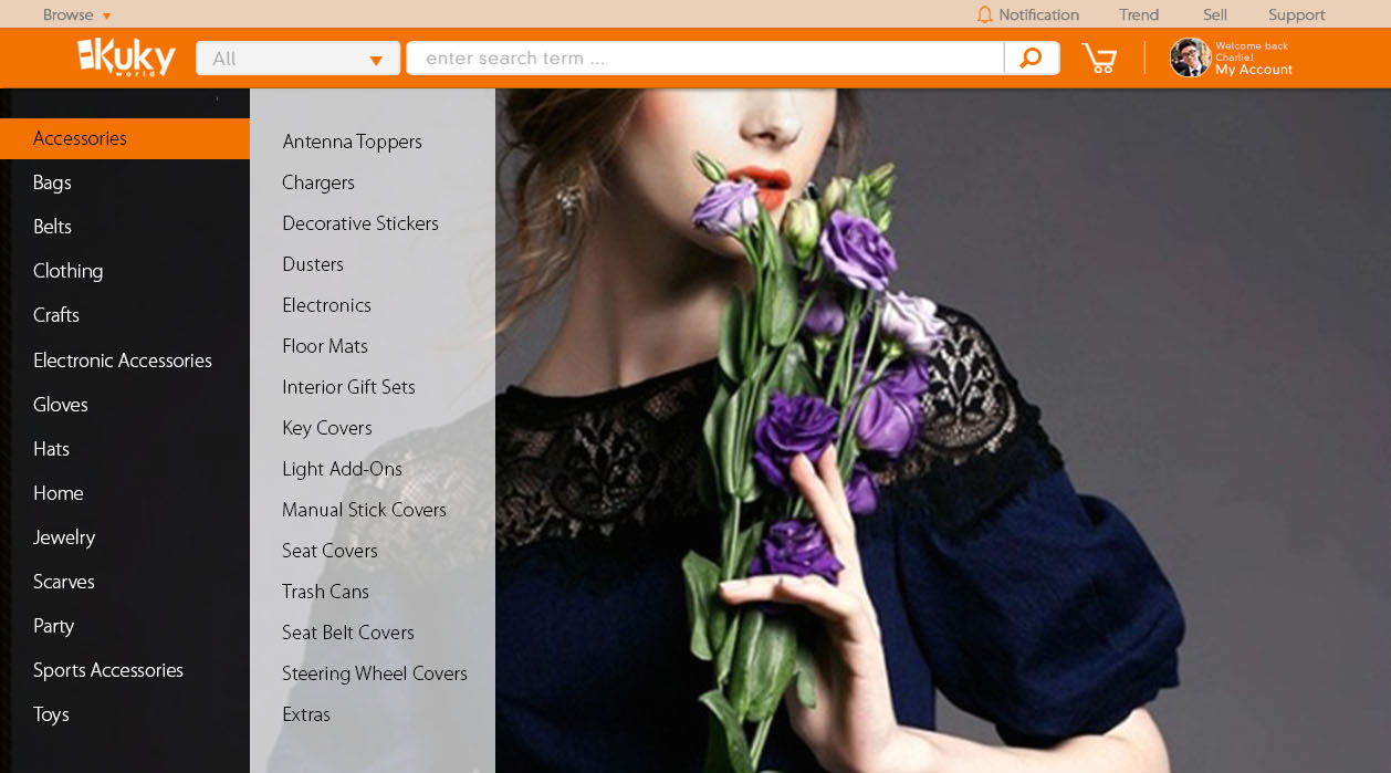
The second prototype includes more comprehensive options for categories and styles. The bicotomy is made less obvious but users can search for goods more comprehensively starting from the homepage. This design allows Kuky World to scale when it has a wide array of different products. I experimented with different menu styles and decided to use the one below. The top bar is also simplified in design.